Overview
Layout that allows the user to swipe left and right through "pages" of content which are usually different fragments. This is a common navigation mode to use instead of ActionBar Tabs with Fragments.

Usage
Layout ViewPager
A ViewPager is a layout which can be added to any layout XML file inside a root layout:
<?xml version="1.0" encoding="utf-8"?>
<LinearLayout xmlns:android="http://schemas.android.com/apk/res/android"
    android:layout_width="match_parent"
    android:layout_height="match_parent"
    android:orientation="vertical">

    <android.support.v4.view.ViewPager
        android:id="@+id/vpPager"
        android:layout_width="match_parent"
        android:layout_height="wrap_content">
    </android.support.v4.view.ViewPager>
</LinearLayout>
If you want an "indicator" that displays the pages available at the top as shown in the screenshot above, you need to include a nested indicator view called a PagerTabStrip:
<android.support.v4.view.ViewPager
   android:id="@+id/vpPager"
   android:layout_width="match_parent"
   android:layout_height="wrap_content">

   <android.support.v4.view.PagerTabStrip
        android:id="@+id/pager_header"
        android:layout_width="match_parent"
        android:layout_height="wrap_content"
        android:layout_gravity="top"
        android:paddingBottom="4dp"
        android:paddingTop="4dp" />

</android.support.v4.view.ViewPager>
which will automatically display the page indicator for your pager. You might want to check out the popular ViewPagerIndicator for an improved page indicator.
Define Fragments
Next, let's suppose we have defined two fragments FirstFragment and SecondFragment both of which contain a label in the layout and have implementations such as:
public class FirstFragment extends Fragment {
	// Store instance variables
	private String title;
	private int page;

	// newInstance constructor for creating fragment with arguments
	public static FirstFragment newInstance(int page, String title) {
		FirstFragment fragmentFirst = new FirstFragment();
		Bundle args = new Bundle();
		args.putInt("someInt", page);
		args.putString("someTitle", title);
		fragmentFirst.setArguments(args);
		return fragmentFirst;
	}

	// Store instance variables based on arguments passed
	@Override
	public void onCreate(Bundle savedInstanceState) {
		super.onCreate(savedInstanceState);
		page = getArguments().getInt("someInt", 0);
		title = getArguments().getString("someTitle");
	}

	// Inflate the view for the fragment based on layout XML
	@Override
	public View onCreateView(LayoutInflater inflater, ViewGroup container,
            Bundle savedInstanceState) {
		View view = inflater.inflate(R.layout.fragment_first, container, false);
		TextView tvLabel = (TextView) view.findViewById(R.id.tvLabel);
		tvLabel.setText(page + " -- " + title);
		return view;
	}
}
Setup FragmentPagerAdapter
Now we need to define the adapter that will properly determine how many pages exist and which fragment to display for each page of the adapter by creating a FragmentPagerAdapter:
public class MainActivity extends AppCompatActivity {
	// ...

    public static class MyPagerAdapter extends FragmentPagerAdapter {
	private static int NUM_ITEMS = 3;

        public MyPagerAdapter(FragmentManager fragmentManager) {
            super(fragmentManager);
        }

        // Returns total number of pages
        @Override
        public int getCount() {
            return NUM_ITEMS;
        }

        // Returns the fragment to display for that page
        @Override
        public Fragment getItem(int position) {
            switch (position) {
            case 0: // Fragment # 0 - This will show FirstFragment
                return FirstFragment.newInstance(0, "Page # 1");
            case 1: // Fragment # 0 - This will show FirstFragment different title
                return FirstFragment.newInstance(1, "Page # 2");
            case 2: // Fragment # 1 - This will show SecondFragment
                return SecondFragment.newInstance(2, "Page # 3");
            default:
            	return null;
            }
        }

        // Returns the page title for the top indicator
        @Override
        public CharSequence getPageTitle(int position) {
        	return "Page " + position;
        }

    }

}
For more complex cases with many pages, check out the more dynamic approach with SmartFragmentStatePagerAdapter explained later.
Apply the Adapter
Finally, let's associate the ViewPager with a new instance of our adapter:
public class MainActivity extends AppCompatActivity {
	FragmentPagerAdapter adapterViewPager;

	@Override
	protected void onCreate(Bundle savedInstanceState) {
		super.onCreate(savedInstanceState);
		setContentView(R.layout.activity_home);
		ViewPager vpPager = (ViewPager) findViewById(R.id.vpPager);
		adapterViewPager = new MyPagerAdapter(getSupportFragmentManager());
		vpPager.setAdapter(adapterViewPager);
	}

	// ...
}
And now we have a basic functioning ViewPager with any number of fragments as pages which can be swiped between.
Selecting or Getting the Page
We can access the selected page within the ViewPager at any time with the getCurrentItem method which returns the current page:
vpPager.getCurrentItem(); // --> 2The current page can also be changed programmatically with the
vpPager.setCurrentItem(2)With this getter and setter, we can easily access or modify the selected page at runtime.
Setup OnPageChangeListener
If the Activity needs to be able listen for changes to the page selected or other events surrounding the ViewPager, then we just need to hook into the ViewPager.OnPageChangeListener on the ViewPager to handle the events:
// Attach the page change listener inside the activity
vpPager.setOnPageChangeListener(new OnPageChangeListener() {

	// This method will be invoked when a new page becomes selected.
	@Override
	public void onPageSelected(int position) {
		Toast.makeText(HomeActivity.this,
                    "Selected page position: " + position, Toast.LENGTH_SHORT).show();
	}

	// This method will be invoked when the current page is scrolled
	@Override
	public void onPageScrolled(int position, float positionOffset, int positionOffsetPixels) {
		// Code goes here
	}

	// Called when the scroll state changes:
	// SCROLL_STATE_IDLE, SCROLL_STATE_DRAGGING, SCROLL_STATE_SETTLING
	@Override
	public void onPageScrollStateChanged(int state) {
		// Code goes here
	}
});setOnPageChangeListener on your PagerSlidingTabStrip object instead of on your ViewPager. You must do this because the ViewPager only supports notifying one listener.
Tabbed Interface with Pager
We can use the ViewPager to display a tabbed indicator in order to create tabs to display our fragments. At Google I/O 2015, Google announced a new TabLayout class that makes creating this tabbed interface fairly easy to do. See Google Play Style Tabs using TabLayout for a walkthrough.
An alternative approach to achieve this is to use the third-party PagerSlidingTabStrip library.
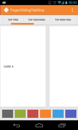
In this way, we can use the same pager system described above and augment the pager with a tabbed navigation indicator.
Dynamic ViewPager Fragments
In certain cases, we may require a dynamic ViewPager where we want to get access to fragment instances or with pages being added or removed at runtime. If your ViewPager is more dynamic with many pages and fragments, we will want to use an implementation of the alternate FragmentStatePagerAdapter instead. Below shows us how to use this and also intelligently cache the fragments for easy lookup.
Setup SmartFragmentStatePagerAdapter
First, copy in the SmartFragmentStatePagerAdapter.java which provides the intelligent caching of registered fragments within our ViewPager. This solves the common problem of needing to access the current item within the ViewPager.
Now, we want to extend from SmartFragmentStatePagerAdapter copied above when declaring our adapter so we can take advantage of the better memory management of the state pager:
public class MainActivity extends AppCompatActivity {
    // ...
    private SmartFragmentStatePagerAdapter adapterViewPager;

    // Extend from SmartFragmentStatePagerAdapter now instead for more dynamic ViewPager items
    public static class MyPagerAdapter extends SmartFragmentStatePagerAdapter {
	private static int NUM_ITEMS = 3;

        public MyPagerAdapter(FragmentManager fragmentManager) {
            super(fragmentManager);
        }

        // Returns total number of pages
        @Override
        public int getCount() {
            return NUM_ITEMS;
        }

        // Returns the fragment to display for that page
        @Override
        public Fragment getItem(int position) {
            switch (position) {
            case 0: // Fragment # 0 - This will show FirstFragment
                return FirstFragment.newInstance(0, "Page # 1");
            case 1: // Fragment # 0 - This will show FirstFragment different title
                return FirstFragment.newInstance(1, "Page # 2");
            case 2: // Fragment # 1 - This will show SecondFragment
                return SecondFragment.newInstance(2, "Page # 3");
            default:
            	return null;
            }
        }

        // Returns the page title for the top indicator
        @Override
        public CharSequence getPageTitle(int position) {
        	return "Page " + position;
        }

    }

}
Access Fragment Instances
Now with this adapter in place, we can also easily access any fragments within the ViewPager with:
adapterViewPager.getRegisteredFragment(0);
// returns first Fragment item within the pager
and we can easily access the "current" pager item with:
adapterViewPager.getRegisteredFragment(vpPager.getCurrentItem());
// returns current Fragment item displayed within the pager
This pattern should save your app quite a deal of memory and allow for much easier management of fragments within your pager for the right situation.
Set Offscreen Page Limit
Alternatively, you can use the method setOffscreenPageLimit(int limit) provided by ViewPager to set how many page instances you want the system to keep in memory on either side of your current page. As a result, more memory will be consumed. So be careful when tweaking this setting if your pages have complex layouts.
For example, to let the system keep 3 page instances on both sides of the current page:
vpPager.setOffscreenPageLimit(3);This can be useful in order to preload more fragments for a smoother viewing experience trading off with memory usage.
ViewPager with Visible Adjacent Pages
If you are interested in a ViewPager with visible adjacent pages that are partially visible:
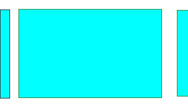
We can do that with by tuning a few properties of our pager. First, here's how the ViewPager might be defined in the XML Layout:
<android.support.v4.view.ViewPager
  	android:id="@+id/pager"
  	android:gravity="center"
  	android:layout_width="match_parent"
  	android:layout_height="0px"
  	android:paddingLeft="24dp"
  	android:paddingRight="12dp"
  	android:layout_weight="1" />
Next, we need to tune these properties of the pager in the containing fragment or activity:
ViewPager vpPager = (ViewPager) view.findViewById(R.id.vpPager);
vpPager.setClipToPadding(false);
vpPager.setPageMargin(12);
// Now setup the adapter as normal
Finally we need to adjust the width inside the adapter:
class MyPageAdapter : FragmentStatePagerAdapter {
    @Override
    public float getPageWidth (int position) {
        return 0.93f;
    }

    // ...
}
For more details, you can follow these guides:
Animating the Scroll with PageTransformer
We can customize how the pages animate as they are being swiped between using the PageTransformer. This transformer exists within the support library and is compatible with API 11 or greater. Usage is pretty straightforward, just attach a PageTransformer to the ViewPager:
vpPager.setPageTransformer(false, new ViewPager.PageTransformer() {
    @Override
    public void transformPage(View page, float position) {
        // Do our transformations to the pages here
    }
});
The first argument is set to true if the supplied PageTransformer requires page views to be drawn from last to first instead of first to last. The second argument is the transformer which requires defining the transformPage method to define the sliding page behavior.
The transformPage method accepts two parameters: page which is the particular page to be modified and position which indicates where a given page is located relative to the center of the screen. The page which fills the screen is at position 0. The page immediately to the right is at position 1. If the user scrolls halfway between pages one and two, page one has a position of -0.5 and page two has a position of 0.5.
vpPager.setPageTransformer(false, new ViewPager.PageTransformer() {
    @Override
    public void transformPage(View page, float position) {
        int pageWidth = view.getWidth();
        int pageHeight = view.getHeight();

        if (position < -1) { // [-Infinity,-1)
            // This page is way off-screen to the left.
            view.setAlpha(0);
        } else if(position <= 1){ // Page to the left, page centered, page to the right
           // modify page view animations here for pages in view
        } else { // (1,+Infinity]
            // This page is way off-screen to the right.
            view.setAlpha(0);
        }
    }
});
For more details, check out the official guide or this guide. You can also review this cool rotating page transformer effect for another example.
Disabling Swipe Events
In certain situations your app might want to have a ViewPager that allows switching pages using an indicator but that doesn't intercept swipe events. This is usually because we want to have the swipe events perform another action rather than change the page.
The first step is to define a custom ViewPager subclass called LockableViewPager. The class inherits from ViewPager and includes a new method called setSwipeable to control if swipe events are enabled or not. Copy this class into your project. Make sure to change your layout file accordingly:
<mypackage.lockableviewpager
    android:id="@+id/photosViewPager"
    android:layout_height="match_parent"
    android:layout_width="match_parent" />
Now, just call setSwipeable(false) to disable swiping to change the page.
Launching an Activity with Tab Selected
Often when launching a tabbed activity, there needs to be a way to select a particular tab to be displayed once the activity loads. For example, an activity has three tabs with one tab being a list of created posts. After a user creates a post on a separate activity, the user needs to be returned to the main activity with the "new posts" tab displayed. This can be done through the use of intent extras and the ViewPager#setCurrentItem method. First, when launching the tabbed activity, we need to pass in the selected tab as an extra:
/* In creation activity that wants to launch a tabbed activity */
Intent intent = new Intent(this, MyTabbedActivity.class);
// Pass in tab to be displayed
i.putExtra(MyTabbedActivity.SELECTED_TAB_EXTRA_KEY, MyTabbedActivity.NEW_POSTS_TAB);
// Start the activity
startActivity(i);
If the activity needs to return a result, we can also return this as an activity result. Next, we can read this information from the intent within the tabbed activity:
/* In tabbed activity */
public final static int SELECTED_TAB_EXTRA_KEY = "selectedTabIndex";
public final static int HOME_TAB = 0;
public final static int FAVORITES_TAB = 1;
public final static int NEW_POSTS_TAB = 2;

@Override
public void onCreate(Bundle savedInstanceState) {
    super.onCreate(savedInstanceState);
    setContentView(R.layout.main_activity);
    // Set the selected tab
    setSelectedTab();
}

// Reads selected tab from launching intent and
// sets page accordingly
public void setSelectedTab() {
   // Fetch the selected tab index with default
   int selectedTabIndex = getIntent().getIntExtra(SELECTED_TAB_EXTRA_KEY, HOME_TAB);
   // Switch to page based on index
   vpPager.setCurrentItem(selectedTabIndex);
}
With that, any activity can launch the tabbed activity with the ability to configure the selected tab.
Custom Pages without Fragments
While a ViewPager is often coupled with a Fragment for each page using the FragmentPagerAdapter, there are cases where the pages are better off as plain views.

A good example is an image gallery, where the user can swipe between different pictures. To achieve this, we can extend from PagerAdapter:
// Custom pager adapter not using fragments
class CustomPagerAdapter extends PagerAdapter {

    Context mContext;
    LayoutInflater mLayoutInflater;
    ArrayList<Page> pages = new ArrayList<>();

    public CustomPagerAdapter(Context context) {
        mContext = context;
        mLayoutInflater = LayoutInflater.from(mContext);
    }

    // Returns the number of pages to be displayed in the ViewPager.
    @Override
    public int getCount() {
        return pages.size();
    }

    // Returns true if a particular object (page) is from a particular page
    @Override
    public boolean isViewFromObject(View view, Object object) {
        return view == object;
    }

    // This method should create the page for the given position passed to it as an argument.
    @Override
    public Object instantiateItem(ViewGroup container, int position) {
        // Inflate the layout for the page
        View itemView = mLayoutInflater.inflate(R.layout.pager_item, container, false);
        // Find and populate data into the page (i.e set the image)
        ImageView imageView = (ImageView) itemView.findViewById(R.id.imageView);
        // ...
        // Add the page to the container
        container.addView(itemView);
        // Return the page
        return itemView;
    }

    // Removes the page from the container for the given position.
    @Override
    public void destroyItem(ViewGroup container, int position, Object object) {
        container.removeView((View) object);
    }
}
This is most commonly used for image slideshows or galleries. See this image gallery tutorial or this viewpager without fragments guide for more detailed steps.
References
- http://architects.dzone.com/articles/android-tutorial-using
- http://developer.android.com/training/animation/screen-slide.html
- http://developer.android.com/reference/android/support/v4/view/ViewPager.html
- http://android-developers.blogspot.com/2011/08/horizontal-view-swiping-with-viewpager.html
- http://viewpagerindicator.com/
- http://mobile.tutsplus.com/tutorials/android/android-user-interface-design-horizontal-view-paging/
- http://tamsler.blogspot.com/2011/10/android-viewpager-and-fragments.html
- http://www.truiton.com/2013/05/android-fragmentpageradapter-example/
'Android' 카테고리의 다른 글
| volley 이미지 원형틀로 만들기 (0) | 2016.03.03 |
|---|---|
| Android - 연락처 가져오기 (0) | 2016.02.17 |
| <안드로이드>안드로이드 UI 모음 사이트 (0) | 2016.01.12 |
| 디자이너도 알아야 할 DP ( Device Independence Pixel )의 개념 (0) | 2016.01.11 |
| <안드로이드> 테이블레이아웃 열간격 일정하게 맞추기 (0) | 2016.01.08 |


